Environmental Graphic Design (EGD): What is it exactly?
Wikipedia defines EGD as a design profession embracing many design disciplines including graphic design, architecture, industrial design and landscape architecture. Practitioners in this field are concerned with the visual aspects of wayfinding, communicating identity and brands, information design and shaping a sense of place.
There are many misconceptions on what EGD really is. As a multidisciplinary profession merging many different fields, it is easy to understand how someone not directly involved would get confused. The lack of clear definition though, is one of its greatest strengths. Another aspect of confusion derives from the many terms that are loosely given for EGD such as: environmental graphics, architectural graphics, wayfinding, signage, super graphics, etc. When it comes down to it, they all form under the category Environmental Graphic Design.
EGD is a graphic communication system for a given site within a built environment. Many think since the word “environment” is used, it is related to sustainability, green buildings and focusing on our environmental footprint. Even though it is important to consider sustainable materials and to be environmentally responsible regarding our design practices, the word ‘environmental’ has no relationship to the natural world. Instead, it is part of a larger, more holistic design theory that involves creating an atmosphere through the use of graphic design fundamentals; designing in the three-dimensional environment rather than two-dimensional mediums.

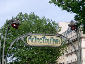
Let’s start where it all began. Until the beginning of the 1900s, many inventions were being developed. One of the earliest influential movements to kickstart EGD is the Art Nouveau movement promoting The Paris Exposition with the Metro station entrances designed by architect, Hector Guimard. The integrated “Metropolitan” lettering seen on the signs became one of the earliest, most widely recognized and documented examples of EGD. In the post war economic boom of the 1950s and 1960s, design and architecture merged further as architectural spaces grew in size and complexity. By the 1970s, the term ‘environmental graphic design’ evolved.
There are four important components that break down EGD: wayfinding/signage, information design, architectural spaces and the experience. Many successful healthcare facilities utilize these environmental graphic design components within their system. It is very important for healthcare spaces to use effective communication for their patients, caregivers and visitors to create an opportunity to educate, entertain, engage and enhance those using the space.
Wayfinding/Signage: It is crucial for designers to create "visual paths" through an environment. With the use of colors, iconography and design elements, visitors can easily recognize a space and train one’s mind with that connection of a particular space or area to navigate from one place to another. By using themed zones throughout the hospital, the wayfinding system is easier to use and saves countless hours by allowing staff and visitors to move more efficiently throughout the building.


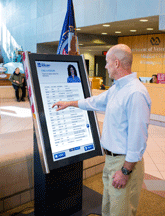
Information Design: Visual illustrations of information, facts or knowledge are easier to understand and follow when arriving in a new location you may not be familiar with. Transforming data into charts, maps and diagrams displayed onto panels, question and answer flip books or touch screens allow the visitor to use significantly less effort to retrieve necessary information needed to navigate through their experience.
Architectural Spaces: This may be considered the most important component; it is what makes up the “environment”. The space is what sets the foundation for the experience. Considering traffic patterns will not only enhance the experience for visitors and patients, but ensure proper work flow between staff. Interior design also plays a major role in architectural spaces. It is driven by the consideration of the “moments” of engagement between people and the hospital’s goals, as well as the emotions and memories that these moments ultimately create.
The Experience: Health systems strive to create memorable impressions with their patients. Branding colors, flooring, fixtures and imagery are all taken into account to create an environment. Different hospital environments will have a different feel from another. A children’s hospital is bright, colorful and playful compared to a cancer center where the environment projects a sense of calm.

Environmental graphics, done well, can have a positive effect on brand. Graphics help drive home the essence of the brand, which gives positive first impressions. So if your environment is not working for your brand, consider the investment to enhance it and reap its rewards. Factors such as branding and identity, which were nearly non-existent when many architecture firms were founded, are the driving force in the profession now and will continue to grow. Clients are reaching out to firms who can not only create a beautiful hospital for them, but to also provide the signage, wayfinding, theming, branding, super graphics, print media, donor recognition; the whole package!
Authored by: Jessica Mingione, formerly a Graphic Designer with Array Architects.

