With the goal of creating a strong unit identity, Array’s design team was inspired by the many different environments in the Washington, DC area. The team presented theming options of an urban cityscape; the gardens of the US National Botanical Gardens and Hillwood gardens; and, a water theme representing the Potomac River and Chesapeake Bay. The goal of the three themes was to represent areas in and around DC that many of the Medical Center’s pediatric patients call home. We encouraged design themes that were more directly related to the natural environment understanding the benefits of biophilic design in healing environments and incorporating softer elements to help normalize the stigma around psychiatric care environments. With a diverse demographic surrounding the center, the design team strove to keep theming neutral for a variety of cultures, genders and age groups to invite all patients and visitors to feel at home in their new surrounds.
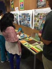 Through a top-dotting session, the design team and focus groups determined that we would join the garden and water themes for the Behavioral Health Unit to create a whimsical forest-like aesthetic. Array began exploring ideas to create a whimsical, yet biophilic, design that drew from nearby natural environments to foster a sense of place and belonging for patients and their families. The design challenge, however, came with a minimal number of windows available in the project footprint. The design team used creative methods to incorporate nature in an elegant yet playful way. A nod to the nature theming is the blue and green color palette which plays a strong role in the overall design. While the bright color palettes adds a distinct playfulness to the unit, the shades of each color allude to the more subtle shadows found in nature as you look up into the trees and notice the overlapping of leaves, or see the shadows that trees cast on rippling water below. This bright palette is coupled with natural wood tones and warm neutrals to ground the overall design of the unit and include elements typically found in home-like environments. Beyond colors and patterns, the design team worked with Array’s in-house graphic designers to build a cohesive scheme of environmental graphics which tie the entire Unit together with elements of one graphic peeking through in an transparent layer of another, guiding patients and visitors through the ‘trail’ created in the unit.
Entry
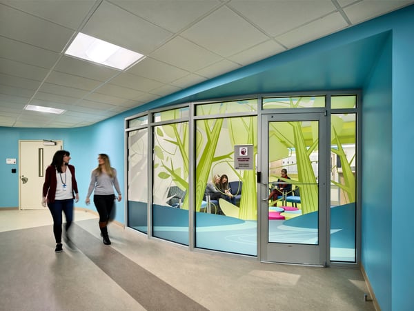 The very first welcoming moment to the Unit is a large scale graphic which includes elements of nature in whimsical trees and a flowing river. The graphic includes a variety of opacities, as well as translucent white backgrounds, to create a balance between sophisticated and playful. This graphic proved to be the most difficult to design as it needed to play many roles. Since this is the first time the Unit has had a dedicated waiting and reception-type space, it was extremely important to the design team and focus groups to be sensitive to the privacy of families and patients within the space. However, with safety being top priority on the Unit, the visual connection from the team center through waiting and into the main corridor was critical. With this graphic and waiting space being the first experience on the Unit, it was important to the design team to include many aspects of the forest theming. While the river and trees are evident on the glazing, the pops of pink, green and blue in the ottoman, which doubles as child seating, beyond mimics the bright flowers in the forest. This first moment when entering the unit not only appears welcoming, but brings a touch of the outdoors and a lively, biophilic feel to the interior-located entrance space.
Patient Rooms
Through the programming exercises, it was discovered that a unique identity in each patient room was a high priority for staff to help create a feeling of home and a sense of individuality for each patient. The varying graphics in each room, between trees, water and flowers, are just one way in which each patient gains a sense of their personalization in their space. These distinct graphics were designed to be a more whimsical, a ‘dream-like’ silhouette within the bed ‘cocoon-like’ alcoves, and encourage a sense of wonder as the patients doze off to sleep.
To encourage the forest theme, the design team used warm wood tones for the flooring and in custom designed beds and wardrobes. The warmer woods mimic the trees of the forest and warm the space, giving a more residential feel to the patient rooms. The inclusion of home-like elements help to normalize overnight stays in a care environment, especially for younger patients.
The soft curved benches in the semi-private patient rooms were designed to mimic the soft edges of the natural environment. It was designed to both encourage interaction and play between the patients, as well as give each patient a sense of their own designated space on either side of the organic divider, supporting each patient in their particular healing and coping methods.
The transom light above the doorway and patient toilet rooms was designed as a safety feature, to allow staff members to see from the corridor when a patient has turned on their light or entered their private toilet room. The glazing in the transom enhances the theming as it mimics bubbles rising from the fish underwater. The translucent pattern allows for light to pass through and warn nurses of movement in the room, while still obscuring vision just enough for the patient to feel that it isn’t impeding their privacy. It has grown increasingly important to camouflage physical safety measures in the design in order to maintain patient integrity and create fundamentally respectful environments for patients and their families.
Exercise Room
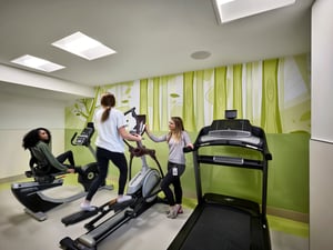
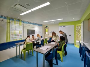
The large activity room is used most often by patients and staff. This room is used for dining, games, classroom learning, movie nights and beyond. We wanted to bring the theme of the natural environment into this fully interior located multi-function space. We did this by bringing a large-scale graphic to anchor the room and focus attention to the main ‘entertainment wall.’ The wall was digitally printed on a DIRTT wall system to create an interactive space with multiple screens and a writable surface to facilitate just about any activity. Because this space is designed to be used by both the child and adolescent populations, Array’s graphics team created a sense of whimsy while maintaining a mature overall aesthetic. The large color blocks of water and the similar tree design from the exercise room and entrance graphics create a sense of sophistication while the butterfly trailing along the top of the design ties directly back to the mural younger patients experience in their quiet activity room on the opposite side of the Unit.
The blue and tan waved floor pattern builds on the theming. The large blue swath of color indicates the children’s area during a classroom learning session, while the tan distinguishes where the teacher will stand while instructing. The undulated wave-like pattern creates a gesture of distinction between the spaces without creating a hard separation.
Tree House
The ‘tree houses’ in the back of the activity rooms are designed with custom 3Form resin panels that incorporate both leaf and branch patterns in green shades to mimic natural shadows of the trees. The panels hug a curved solid surface bench to create a small retreat in the rear of the activity rooms. The space was designed to provide a self-coping environment for patients to retreat to during a stressful playing or learning session. The translucent panels of the tree houses blur the lines between spaces and create a direct connection to the corridor. Beginning to filter in natural daylight from patient rooms beyond, the internally-planned space gains a sense of ‘time of day’ and natural light to help patients and staff to maintain their circadian rhythms.
Virtual Fish Tank
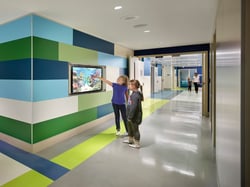 In the corridor of the children’s unit, the design team incorporated a virtual fish tank, recessed into an impact-resistant phenolic panel accent wall. The fish tank location was chosen to create an incidental area, not far from the safe space of the patients’ room, to foster social and emotional growth within each patient. Keeping with the theme of the overall unit, the fish tank typically plays scenes that appear to be from a local river or lake.
Quiet Activity
The quiet activity room was designed specifically for the younger population. The graphic incorporates more whimsical animals with intricate patterning details that become more apparent the closer the viewer gets to the graphic, encouraging an elongated interaction with the wall itself. The mural depicts marine life both above and below the waterline and the interactions of plant and animal to encourage curiosity in the younger population. Below the graphic, the design team installed a wave-like textured resin to simulate the rippling of water. The texture and pattern create a multi-sensory experience for younger autistic patients, a population the Medical Center focused much of the design and planning effort toward. The fish shaped ottomans tie into the whimsical ‘under water’ concept of this space, and double as a place for patients to sit as they enjoy group therapy lessons and story time or a movie on the recessed monitor beyond.
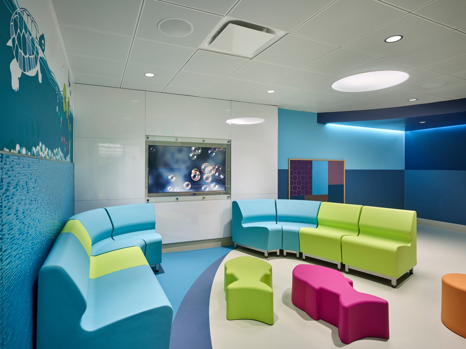
The multi-disciplinary approach taken with this project, from locating similar age cohorts adjacently to providing a wide-reaching theme which appeals to all age groups, the updated Behavioral Health space now provides one secure location from which caregivers can treat their patients. The team thoroughly enjoyed escaping to this outdoor world of wonder while designing a Unit they believe will aid in the healing process.
Article authored by Madeline Hill, a former interior designer at Array.
