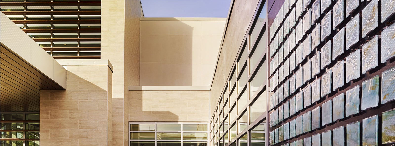
An academic medical center/medical school in Dallas tasked my team with renovating its medical student study carrels. This project includes approximately 20,000 SF of interior renovation of six student carrels and supporting mechanical rooms. The plan calls for a gut renovation and complete fit out with new partitions, equipment and furniture.
Each of the Medical College's sections are named after former, prominent area doctors. Each Section has its own identity, including colors, which encourages friendly competition. Although selection into one of the six Colleges is through a lottery system, the students are proud to belong to their respective College.
Throughout the design process, it was important we keep each unique identity in mind while still providing them with the same accommodations and amenities. One way we instilled each College's unique identity was by highlighting each individual entry doors with its color in light.
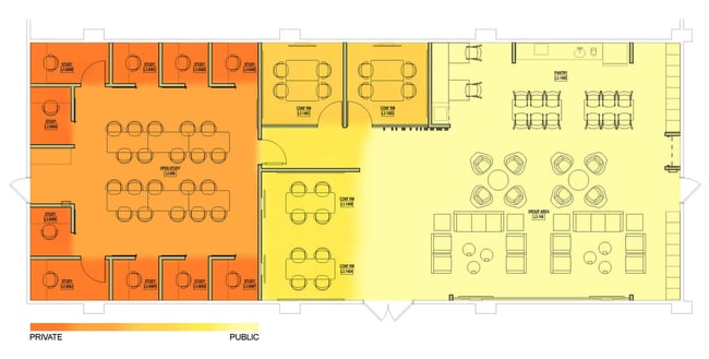
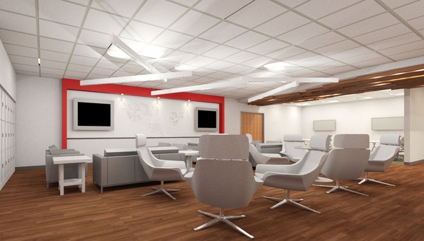
The wood slat entry leads to the group activity area where there is a small kitchen area, lockers and a group area with two large monitors for group lectures and events. Adjacent to the group areas we incorporated two semi private huddle areas and two enclosed huddle rooms. Each College also includes a quiet group study area surrounded by individual study carrels; its colors used as focal points and fabric for furniture.
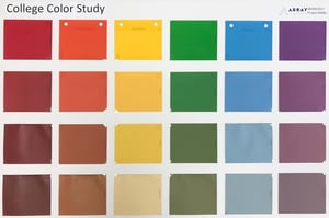 Upon completion, this project will include a total of 40 student carrel spaces per College. To help our client understand the furniture and spaces they would have, Array held a furniture mock-up meeting. We selected one-inch cardboard to represent the walls and counters, using metal channels and connectors to hold the cardboard in place to create a visualization of one of the student carrel spaces. We took it a step further and painted the cardboard an accent color to solicit user feedback on color placement. The final palette will consist of colors from each of College to keep school pride at the forefront.
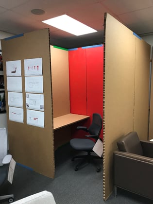 Prior to the mock-up session, we also pulled the extended team together during meetings where we provided such activities as a top-dot exercise to solicit opinions on inspirational imagery to guide our design.
With more than 1,500 hours logged on this effort to date, it is important for us to step out of our 2D drawings and meet with the client at a truly three-dimensional level. Building the mock-up and walking through usage scenarios with the client brings our collaborative effort full circle with a tactile build everyone can experience, and provides us with meaningful feedback.
Users appreciated the mock-up session as it gave them a real sense of the size and functionality of the space. The mock-ups were such a hit, our client asked us to leave the mock-up kit pieces behind for them to use. While we could not leave them our kit (we need it for other clients), we are looking forward to the next engagement to put our mock-up kit back to good use.
Blog authored by Adrian Negron, former architectural designer with Array.
