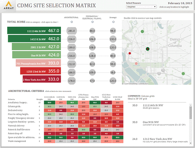
Within the architecture profession, creating, receiving and generating data is a daily task. Ambulatory Surgery Facility Assessments, for instance, have the potential to generate large sets of data that various team members, including clients, review and use to make critical decisions.
From available square footage to elevator requirements, from emergency power to plumbing, the assessment team rates each item assessed for each facility. If, at each site, there are 73 items to assess and there are seven sites, the assessment report will result in a large spreadsheet or PowerPoint presentation that may not be easily digestible or visually appealing. In addition to the assessed items and their ratings, an assessment report will also provide comments for each criterion and a weighted score, to establish item importance.
A spreadsheet style report will most likely contain multiple columns and colors to differentiate various sites and items from one another. It can also take the form of a presentation with slides dedicated to a site and item groups. Alternatively, the team can create an interactive data visualization experience that presents the same data in a manner that can result in more clarity for the viewers.
Utilizing Tableau, a data analysis and visualization software, to generate an interactive site selection tool from data collected during facility assessments, you can achieve a level of clarity that is difficult with static spreadsheets or PowerPoint presentations. Rather than scrolling through dense spreadsheets, the viewer can highlight a site by clicking on its address and see its data, such as overall rating, individual item group ratings, comments, criterion and criterion weight, or any other associated data while simultaneously seeing how that data compares to other locations.

The goal is to create easily digestible data to inform and influence our client’s healthcare real estate decisions. With the ability to see individual site information, as well as individual criterion information, while still being able to visually compare, clients have a clear understanding of the differences between sites, enabling them to make better-informed decisions.
By controlling the graphic’s aesthetics, we provide a clear hierarchy using dramatic coloring and varying sizes based on criteria and site ratings. Displaying this data on a dynamic location map enables the viewer to see the various sites in relation to each other as well as our clients’ existing locations.
Gathering data and quickly creating presentable, interactive data visualizations is not only useful in facility assessments. Instead of creating static, one-dimensional reports, we can create interactive graphics from a client’s data volumes or in conjunction with discrete event simulation.
As the design/construction and healthcare industries increasingly rely on data, the opportunities to use data visualization to improve healthcare design planning increase as well. From early strategic planning to functional and space program development, utilizing data visualizations can offer deeper insights into a health system’s needs. Moreover, in Array Architects case, the ability to live-connect to data or receive automated updates within a visualization platform reinforces our continuous improvement culture. By tracking real-time internal process and workflow data, we can continually improve our processes and strategies to better serve our employees and our clients.
This blog post was written by Seena Hassouna, a former healthcare planner with Array.

