 Millions of women are screened for breast cancer each year. For many, it can cause fear and anxiety. Many women choose not to schedule their screening due to the fear of having cancer, the exam being uncomfortable, or believing they’re not at risk for getting cancer. When designing a mammography suite, there are many factors we should consider to reduce those fears as well as provide a welcoming and comfortable experience for patients and staff.
What’s a Mammogram? How’s it done? How long does it take?
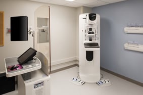
A mammogram is an X-ray picture of the breast that doctors use to detect early signs of breast cancer. Regular mammograms are the best tests doctors have in order find early signs of breast cancer, sometimes as early as 3 years before it can be felt. The patient stands in front of an X-ray machine where a technician places the breast on a clear plastic plate. Another plate firmly presses on the breast from above until the breast is flat and holding it still while the X-ray is being taken. A screening mammogram takes approximately 10-15 minutes to carry out, including the time for the radiographers to check the quality of the X-rays.
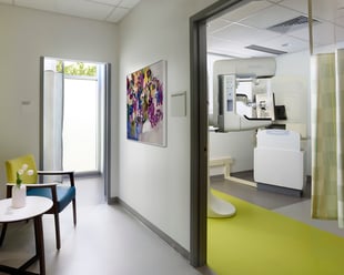
Array Dallas was tasked with redesigning an existing Mammography Suite for Parkland Hospital. This project included approximately 2,400 SF of renovations for better patient entry and staff flow, new mammography equipment, addition of gowned waiting area, and upgraded aesthetics in existing corridors and around the new suite. This mammography suite is expected to see high volumes of patients daily, so designing an efficient flow is critical.
Where did we begin when designing a mammography suite?

Before we began designing, we did a lot of research about mammograms and the codes regarding mammography suites. We found that a lot of mammography suites are leaning to a spa-type ambiance and wanted to incorporate this into our design with the use of color. By using cooler colors throughout the space that are perceived as relaxing and calming, we will help to reduce patient fear and anxiety. Beyond the ambiance and color considerations, there were specific codes we needed to follow when designing the mammography suite.
According to FGI Guidelines: 2.2-3.4.3.4, a Mammography room needs:
- A minimum of 100 square feet.
(1) Visual privacy for patients shall be provided. Views into the mammography room by the public or other patients shall be prevented when the room is in use.
(2) A hand washing station shall be provided in the procedure room.
(3) Changing room(s) for mammography patients shall be immediately accessible to the waiting area and procedure room(s).
 How did we improve patient and staff flow?
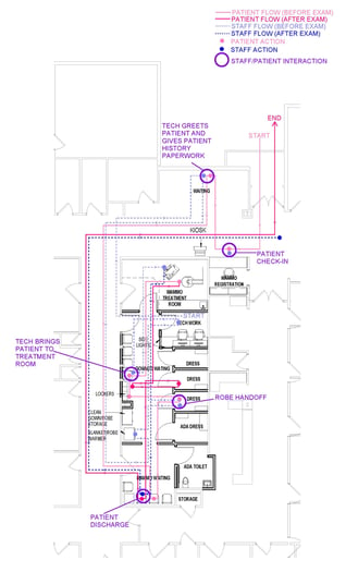
We can improve the patient and staff experience by improving the flow. After patients are brought into the mammography suite from the waiting room, they wait in a sub-wait area until the technician is ready to get them started. Once ready, the patient will proceed into the dressing room, change into their gown, and lock up any personal items in individual lockers located right outside of the dressing rooms. From there they wait until the Radiologist is ready to perform the exam.
Once the exam is complete, the patient will remove their belongings from the locker, continue into the dressing room to change, and dispose of their gown in a linen hamper located in the built-in storage and exit the facility. The built-in storage in the dressing rooms was strategically designed to accommodate enough gown storage for patients for a day. After clinical operations are done for the day, each dressing room will be restocked, and the gown hamper will be emptied.
In the case that a male would need an exam, there is a direct door into the exam room that would eliminate the need for the male patients to interact with the female patients in the sub waiting area. The staff also mentioned this could also be handled from an operational standpoint, where male patients receive the first screenings of the day.
Although there were many limitations due to budget and code restrictions, we were able to successfully complete this project to the owner’s satisfaction while following code. The most rewarding part of this project was interacting with the health care providers and seeing the passion they have for helping their patients.
Interested in learning more about Array's approach to designs like this? Explore our Women & Pediatrics Design Book:
Blog authored by Christina Taylor, former architectural designer with Array.


